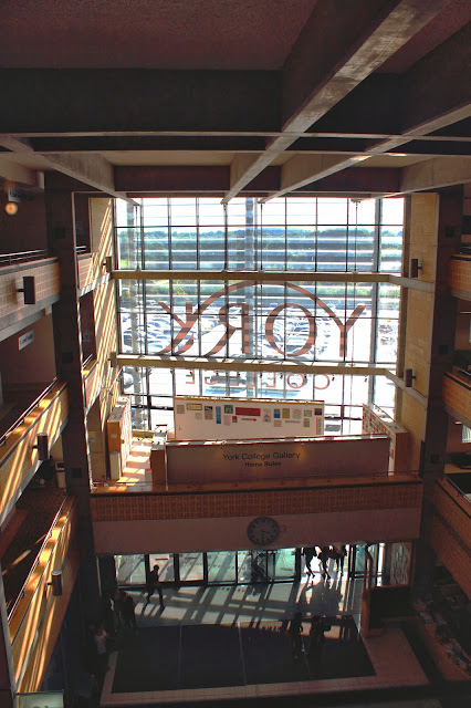
Thursday, 14 November 2013

So, My brief for the project!


Brief for photojournalism.

I intend to produce a series of images of people and their environment, this series will include images from people on the streets and how the interact with daily life. People who are on their way to work, people in the streets or at work, i.e. the Saturday and Wednesday markets in York and Beverley. People and others, this will be how they interact with others in their day to day routines and strangers who they bump into in the street. I will also include people within the college, staff and students and how their college life flows.

I am influenced by mainly two photographers, one is extremely well known in street photography from the less…modern era. Henri Cartier – Bresson he influences me in the kind of how he uses composition and elements within the image to create the composition that makes the effect or mood that he wants to portray.


The second photographer who influences me is modern; Eric Kim shoots people on the streets… NOT in that way that many of you are probably thinking about… He has a creative eye and wanders the streets of Hong Kong, taking images of people who are at work or in their daily routine. These two artists will blend together to create a well composed and creative image.


I will produce the images in a high contrast black and white with punchy shadows to create an enticing image. The reason I chose to take them in black and white is it can force me to contrast (see what I did there) more on the composition and mood of the image its self and people can focus on the people in the image rather than the colors or anything else.

Wednesday, 13 November 2013

Concept

Keeping your images to themes.

When going out and photographing something, you really need a theme to concentrate on or base your images around loosely. If you do not do this then your images, however good, may not be organised and all over the place. Your images want to be in sequence, thats where they're happiest!

If you take a look at other artists they have portfolios or books of different themes such as Lee Friedlander with his book "America by car" and Robert Frank with his book "The Americans" these artists have a series of images which are compiled into books or portfolios.

My ideas

In my imagery I want to focus very loosely on some themes within my imagery because I think that they give a good perspective to them.

Most of my imagery will consist of street photography but i will have different themes within this. My main theme will focus on the urban environment its self and the sub themes will be;


  • Architecture- I will take images of buildings from a low perspective as if I am looking upwards, this will separate the buildings from the busy street life, I will take the images in RAW as most occasions the dynamic range will be too low and the sky will be blown out and I will have to recover this in Photoshop.

  • Reflections- A bit like Lee Friedlander I will take images of reflections of puddles, polished surfaces, windows etc. These give a different perspective than an image taken straight on. I could also use double exposures as a form of reflection because they give a similar effect.

  • People and their environment- This sub series will focus on people within cities and urban areas and how they interact with others and their environment. This will include people going to work and in their everyday life.

Mood boards and Mindmaps?

Does "Photographers block" have you procrastinating your photography? Not knowing what to photograph is one of the biggest pains when it comes to photography, you have a shiny new lens or camera and you're stuck at home bored out of your mind, all you want to o is get out there and take photos but... YOU SIMPLY CANT!! 

Having no idea what to photograph brings on a horde of excuses such as "Its raining" or "the weathers shit" when really that's all they are, excuses.

A mind map is very commonly used to generate tons of ideas for anything really, they have been around for hundreds of years. Firstly think of one word you would like to photograph as a subject such as "reflections" and then branch off sub categories like "windows" and "puddles." these will get you thinking about different ways to shoot the different sub categories.


The next idea which is more related to photography. A mood board is a great way to generate ideas relating to photographs themselves. You take a bunch of images from the subject you would like to photograph and put them in a montage of images which you like and would like to replicate in your own style, here is my example.


Monday, 4 November 2013

Lee Friedlander- Reflections

Lee Friedlander is an american photographer known for his work on reflection photography and his series of photos named "America by car" in these images he has taken them from an angle of which is different to most photographers. He has taken these images either in a car looking out of the window or he has taken the images whilst including himself within them. This gives a new perspective on reflections.


In this image,  lee has included himself in a reflection on a shop window except he has blanked his face out with a poster which makes us look at the image behind him of JFK. It appears to look like he is JFK due to the angle of the shot.


In these two images, Lee has photographed them from the window of his car, Lee uses the reflections of the wing mirror to compress the perspective of things behind him such as the man and woman in this image and the bridge in the one below. due to this change in perspective of the mirror, we are drawn into the contents of it.


I liked the perspective Friedlander gives in his photography so I thought id try it out for myself! in this first image I thought id take one similar to Friedlander's reflection images and it worked, but then I felt like getting a bit creative, after all thats what photography is all about!


The next two images are from large puddles on the streets of Manchester whilst doing a bit of street photography. The images have been flipped to look as if they were taken normally but due to them being reflections in puddles, the perspective of them is changed and this gives a strange approach to the image! We almost miss the fact that they are taken in a reflection and our minds instantly assume that they are normal photos until we delve deeper into the image to reveal that it is no ordinary photograph of a tram line or skyline.


These two images just go to show that rather than always looking in the usual places for an image, try looking somewhere you wouldn't normally to give a different perspective because you never know how they can turn out!


What artists percieve

Achievement

Whether a sense of achievement is within college or in what you perceive it to be, a sense of achievement can be many different things. This blog is all about how artists perceive their image.

Robert Frank is a swiss photographer who went to America to escape the consequences of Hitlers reign. He published a  book called "The Americans" where he displayed how things are percieved by himself in 50s America.

"The Americans" is a famous book by Robert Frank conveying the life of Americans in the 50s, as you can see in the cover photo here, there is black and white segregation on a tram in the city. The way Robert took his images is a different approach to photography as he does not take images how he thinks things are perceived, he takes them how he alone perceives them, this gives his photographs a more personal touch.

I then went out and photographed the theme of "achievement" in and around college in a way that I perceived it, not in a way that it is usually perceived by others.


Diane Arbus

Diane Arbus was an American photographer noted for black-and-white square photographs of "deviant and marginal people or of people whose normality seems ugly or surreal." This is the reason why Arbus was renowned as a "bully photographer" she would pick on people who are "abnormal" especially the disabled and "ugly"!
drag queen
As we can see in this image of a drag queen, Diane Arbus shot it with an attempt to make this person even uglier than usual by photographing them with no make-up, the hair bunched up in rollers and the cigarette in his left hand is also emphasis on this point. Diane also used direct and harsh flash to make the skin tones greasy and washed out!


Twins

Diane photographed these two twins as a posed shot on the streets because she must have thought that because they are twins, this meant that the are different or "abnormal" the two twins may look the same and dress the same, but they are not feeling the same. The twin on our left is pulling a frowned face whereas the one on the right is happy and smiling, this is what Diane used as the hidden message of the image that two peaople will never be the same, no matter how similar.


The image above is one of another drag queen in the streets of New York, Diane yet again picked on this "woman" for their differences and tried to emphasise the lack of attractiveness by using the harsh light to cast shadows in the skin which reveals wrinkles and this light makes the skin greasier! She also shot from a low and unflattering angle with a moderately wide lens to make the subjects face wider than it actually is.


It is this "bully" in Diane's photography which separates her from the crowd. Very few photographers would actually purposefully try to show the worst in people, it is usually the opposite as our jobs as photographers, we are supposed to make people look BETTER but Diane deviated from this style and chose her own which she is clearly good at.

Thursday, 24 October 2013

SebastiĆ£o Selgado

SebastiĆ£o Salgado is a Brazilian social documentary photographer and photojournalist. He focuses on stories of images which come usually in a sequence, such as these images are from his collection of manual labor, named "Workers."


He tries to convey power through the way his images are framed, such as in the image below of the worker stood by ladders full of people, Sebastiao Selgado shot this image from a low perspective to show that the man is powerful and brave due to the manual labor he is doing.


Selgado uses the same technique as before in this image of a manual laborer protesting against the police.He shot the image from a low angle and also from an angle where the policeman is lower down than the worker, this shows that that worker has power over the military police which are supposed to be powerful themselves.


Selgado also uses the strong black and white images to add to the sense of the oily and dirty, hard labor that these people have to do, because of the deep tones our eye is locked within the image. To the left of this image he shows the worker being sprayed with oil and then the huge explosion in the right third of the frame. this shows that he is working in very dangerous conditions and the composition in this image separates these two thirds to add more impact to the image.


Wednesday, 9 October 2013

Focal Length and Sensor size

Focal length is a very useful tool, it is basically the amout your lens is "zoomed in."
Lenses come in different focal lengths, some have only one focal length such as 50mm, 105mm, 35mm. These lenses are called Primes and generally have low apertures such as f/1.8 or below.


Other lenses are called varifocal lenses, basically a lens which can zoom in and out (its focal length can be varied) These lenses come in many different focal lengths but the most common which comes with cameras is an 18-55mm lens, this means that its shortest (zoomed out) focal length is 18mm and its longest (zoomed in) focal lenth is 55mm. Also with lenses, the more that you zoom in (the longer the focal length) the depth of field decreases and you can get the same effect of a 50mm at f/2.8 even using a 200mm at f/8.


Sensor size is the size of your sensor compared to a 35mm full frame (standard for film) for example a the cheaper canon dslrs have a sensor called APS-C which basically means its smaller than the "full frame" by 1.6x. This 1.6x size difference means that the lenses on the camera arent actually the focal length that they state. An 18-55mm standard zoom on a full frame camera would be 18-55mm focal length, whereas on an APS-C sensor, the focal length is x by 1.6, therefore the focal length is actually 28.8-88mm.


The disadvantages of a smaller sensor are that if you want wide-angle shots, the lens you buy isnt as wide as you may wish, for example a 10mm fisheye is actually a 16mm and not as wide. The other disadvantage is that the quality sometimes isnt as good as a full frame sensor in low light. The advantage is that this extra "zoom" proves useful in many cases such as for sports photography and wildlife because it can save you alot of money on buying longer focal length lenses.

Exposure Triangle and Mode dials

The exposure triangle is the collaboration or "reciprocity" of the three exposure controls. Aperture, Shutter Speed and ISO. Each of these three controls have their own effect such as Aperture changes depth of field, Shutter Speed changes how movement is recorded and ISO increases the cameras sesitivity to light. All of these have one thing in common, they can change the Exposure (amount of light let into the camera.)


The "correct" exposure is an image that has the right balance of light and dark but photographers can purposefully under or over expose to add effect to an image. for example in a night photograph which is trying to show darkness, you would want to under expose by about 1 stop on the exposure meter to portray darkness because you wouldn't want the "correct" exposure as this would be too light. this happens because the camera takes a reading of the scene at an average and compares it to an average light reading.

The exposure meter is located in your cameras viewfinder for easy and quick reference.


 Mode dials are a very useful tool that comes with most cameras, especially every dslr. It is located on the top of the camera body, the mode dial accommodates a variety of different selections which are different with every camera, for example beginner dslrs have a variety of automatic selections such as sports mode and portrait or macro. These selections are not always on more professional dslrs because the photographer can create a "sports mode" by simply changing his shutter speed and macro mode by using a macro lens, it is not the camera which does the macro-ing...


 This is the mode dial on a Canon 600d (semi-pro) as you can see it has alot more automatic modes.


This is an image of the 5D mark 3 mode dial which as only one automatic mode as it is a professional body.

Monday, 7 October 2013

Henri Cartier- Bresson, Image analysis


Image Analysis - Henri Cartier-Bresson


Henri Cartier- Bresson is a famous street photographer from the 1900s. He is known for his black and white, well composed street photography where he follows compositional techniques strongly and used them to convey different emotions in his imagery. 


For example in this image, Henri uses the "fibonacci spiral" or "golden spiral" to convey a sense of depth. His subjects are seeming to be the children but the main subject is actually the geometry its self in the spiral, the children just act as an aid to the naturally occurring lead in lines of the spiral as we start from the first face and follow the spiral "upwards". Our mind naturally follows the spiral all the way to the centre and sometimes we ignore the children due to the strong geometrical shapes.


This photo is from early 1900s  from Henri. The image follows the rule of thirds with the foreground being the main focal point with the two children on the wall, the middle being the lonely child and background being the never ending wall. Lead in lines of the wall and the blocks of floor force you to look into the background of negative space, this creates a sense of loneliness which aids the loneliness of the children and how by climbing the wall, they are trying to escape that.


Here is another lead in line from Mr Cartier- Bresson, his high vantage point creates the sense of elevation and makes us look down on the image. The geometrical shapes and lines of the railings lead us in and the arch frames the rest of the image and directs our attention. It gives a sense of rest as the streets below have people working and he photo is taken higher up as if we are just watching over them.


Henri Cartier-Bresson uses geometric and organic shapes to draw our eyes into the images. He has a strong sense of composition and can convey emotion and feelings through his photography. He uses black and white (mainly because its old film) but this does not divert our attention and he incorporates people within his shapes yet they are not necessarily the main subject.

Sunday, 6 October 2013

Composition

Now we have learned to control our camera and how the settings can affect an image, we need to take the next step in image making.

Composition is basically the way an image is constructed visually. There are some "rules" for composition such as the rule of thirds being the main one and other rules like where to place eyes, how to lead the viewers eyes into the subject of the image and to create symmetry within an image. 

The rule of thirds is the most common rule and most easily used. The rule of thirds grid is basically a 3x3 grid which is usually found on the Liveview screen and also on most smartphone cameras.


This grid can help alot when it comes to beginner photography because it can show you where you can place subjects along the intersecting lines to add interest to the image.

Lead in lines are used to add a compelling and eye catching effect to an image which is very subtle, a line or set of lines in the foreground can lead the viewers eye to the main subject. This effect is also achieved by using foreground interest as a framing technique. By having an object (which is plain and out of focus) in the foreground, this can lead the viewers eye to the main subject, such as in these examples below.                                                         

Foreground interest
Foreground interest
Lead in Lines


Thursday, 3 October 2013

White Balance, Picture Style and RAW

White Balance

White balance is the “temperature of the colours that the camera can record. The camera cannot see where you are in terms of light, for example if you are outdoors the colour temperature/ white balance will be different to when you are inside under tungsten light bulbs.
White balance is measured in degrees kelvin (K) for example Daylight WB is around 5200K and Tungsten (most indoor shots) are around 3200K. If you set the white balance lower than it should be, then your image will come out with a strange colour cast and look unnatural. White balance is set to ensure that the whites in an image are actually white. This effect can be used to create a different type of image, for instance create a warm feeling to a place, like in this photo of the college; it creates a warmer and more inviting feel to the college.


Picture Style

Picture styles are the pre-sets that the camera has internally to change the image in camera, such as black and white where the image is changed to black and white in the camera rather than being changed in post processing later. This has its advantages because there is no need to process the images and can be uploaded quickly, also you can preview your image in a certain picture style. Disadvantages are that the camera chooses which tones to turn black and white, this gives usually a flat image compared to doing this in post processing where you can adjust the levels manually, also the in camera styles cannot be changed back to colour once converted.

This is put into vivid so the colours are more punchy and saturated.

RAW vs JPEG

JPEG images are images out of the camera which have been compressed to save space on a card as for most applications this is fine. When it comes to professional photography you need to use a quality called RAW a lot of the time. RAW images are the whole image without any compression, therefore you get every detail there is out of an image, this is most useful for editing because you can change most settings such as white balance and you can recover an under or over exposed image which is not usually achievable in JPEG.  The disadvantage of RAW is that the file sises are HUGE, for example an 18mp cameras raw file is on average 18mb per image, the Nikon d800 has a 36mp therefore the raw size is around 36 megabytes!

                This is the image recovered in RAW,
all the detail is retained and colours
 are accurate.
This image was recovered in JPEG and the
 colours are off with alot of detail lost and "noise" included.


Friday, 27 September 2013

What is a camera?

What is a camera?

Cameras come in many shapes and sizes, the first "camera" was invented 100s of years ago and named The Camera Obscura. This camera did not record an image like film or digital cameras, it worked like a pinhole camera by projecting an image onto a viewing plate where an artist would trace over. 

The next generation of cameras were fixed image cameras where the image is recorded. the first successful image was made by Nicephore Niepce in around 1816, the image was recorded onto paper coated in silver chloride, this paper darkened when exposed but this made the image only temporary which would be no use in most applications. bitumen was then used with this camera and the exposed areas would harden then unexposed areas dissolve away, leaving an image behind

Within the time between this and film, dry plates were most commonly used in multiple designs which were like prototypes such as field cameras, disguised cameras and twin lens cameras which were used for a while.

The TLR stood for "Twin Lens Reflex" one lens was used for focusing and viewing your image through a viewfinder and the other for capturing the image onto a dry plate.

The invention of film brought cameras to life and really kick-started the image-recording revolution. George Eastman pioneered the paper film, his first camera which he called the well known "Kodak" was first sold in 1888. the camera was a single lens with fixed focus and one shutter speed! the Kodak came pre-loaded with 100 film and once used it had to be sent back to the factory for resetting and enveloping. this camera was the first "automatic camera" as the slogan for sale of the Kodak was "you press the button and we do the rest."


So, now that film has been introduced into the world, out comes the new line of film single lens reflexes (SLRs). Manufacturers from all around the world such as Olympus, Pentax, Canon and Nikon started mass producing these film slrs with new lenses due to the high demand from this new craze. 


So, the film era is making a killing as millions of people own a new SLR camera. But what's this? A new camera which can focus its self! Nikon realised that manual focus was both slow and inaccurate, therefore they created the Nikon F3AF, this was still a film camera but performed like our digital SLRs today and is similar in terms of design.


This then started a new manufacturing innovation when companies such as canon and Nikon started manufacturing Digital cameras where it auto-focuses and has a screen where you can see your images without processing! This was a big event in camera history and this event soon developed with hundreds of different types of cameras now, from PRO DSLRs all the way down to phone cameras. 


Now we have millions of cameras around the world and over 80% of all images uploaded to Facebook were taken on a smartphone! What will the future of digital imagery hold?


Thursday, 26 September 2013

Shutter Speeds

Shutter speed means the duration of time that the cameras shutter is held open for, this is measured in fractions of a second such as 1/200th , all the way down to seconds such as 1”. The cameras shutter is located behind the mirror but just in-front of the sensor, the shutter also protects the sensor when its not in use.

Shutter speed changes the way movement is recorded in the camera. It also changes the amount of light entering the sensor. If you have a shutter speed of 1/4000th the subject will appear frozen as the light bouncing off the subject has not had time to change before the shutter has closed. Now, being able to freeze action is great but it does come with one flaw, light.

If the shutter is only left open for a very short duration of time then there isn’t enough time for light to be recorded and in situations such as a dark room, this is inadequate. If the shutter is left open for a long duration of time, then the light has time to change and movement is recorded. This movement can be the movement of people within a scene or can result in camera shake with shutter speeds below 1/50th. the best ways to reduce camera shake are:

1. Use a tripod! If you experience camera shake during long exposure photography then the most useful tool is a tripod. A good, sturdy tripod will last a long time.2. Monopod. If I tripod is too heavy or just not your thing, then a monopod is very useful for most things including sports or wildlife photography because they are mobile and usually quite light.3. Image stabiliser for Canon or Vibration reduction for Nikon lenses, this little switch on your camera is very useful and can sometimes allow you to go four stops lower in shutter speed than usual!4. If none of these methods are available to you, the general rule of thumb for handling a dslr is to keep to the same shutter speed as your focal length because as you zoom in, vibration and camera shake are magnified drastically. For example If you are shooting at 200mm, keep your shutter speed to 1/200th, if you are shooting at 50mm then you can go to 1/50th of a secondShutter speed can be used for cool effects such as light trails or movement in clouds and water to create a dreamy effect. So get out there and experiment with different shutter speeds to create different effects with you images.

0.5s
1/360th
1 Second